Superimpose Graphs in Excel: Easy Visual Guide

In data analysis and presentation, Microsoft Excel is a powerful tool that offers extensive capabilities to manipulate, analyze, and visually represent data. One of its many features is the ability to superimpose graphs, which can help in comparing different data sets or displaying multiple types of information on a single chart. This technique can be particularly useful for spotting trends, correlations, or for creating visual comparisons that might not be as apparent when looking at separate graphs. Here, we'll explore how to superimpose graphs in Excel, guiding you through the process with step-by-step instructions.
Understanding Superimposed Graphs
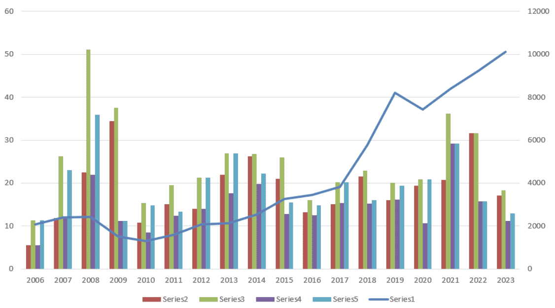
Superimposed graphs involve layering one or more charts over another. This means you can have, for example, a bar graph and a line graph on the same chart to illustrate different aspects of the same data set or to compare different but related data sets.
- Why Superimpose Graphs? To visually compare different data series, highlight trends, and enhance data storytelling.
- Types of Graphs to Superimpose: You can combine bar, line, scatter, area, or even pie charts, although not all combinations make sense for every dataset.
Step-by-Step Guide to Superimposing Graphs
1. Preparing Your Data
The first step in creating a superimposed graph is ensuring your data is ready:
- Ensure your data is clean, organized, and in a format that can easily be used for chart creation. For instance, related data points should be in the same column or row for easy selection.
- Name your data ranges if you’re working with large datasets. This can make selecting data for chart creation much easier.
2. Creating the Base Chart
Start by creating the first chart:
- Select your data range.
- Go to Insert > Chart and choose the type of chart you want to use as the base, like a bar or line chart.
- Format the chart to fit your preference regarding colors, titles, and axes labels.
3. Adding Another Data Series
Here’s how you can add another data series to your existing chart:
- Right-click on the chart.
- Select Select Data from the context menu.
- In the Select Data Source dialog, click the Add button.
- Enter your new data series in the Edit Series window.
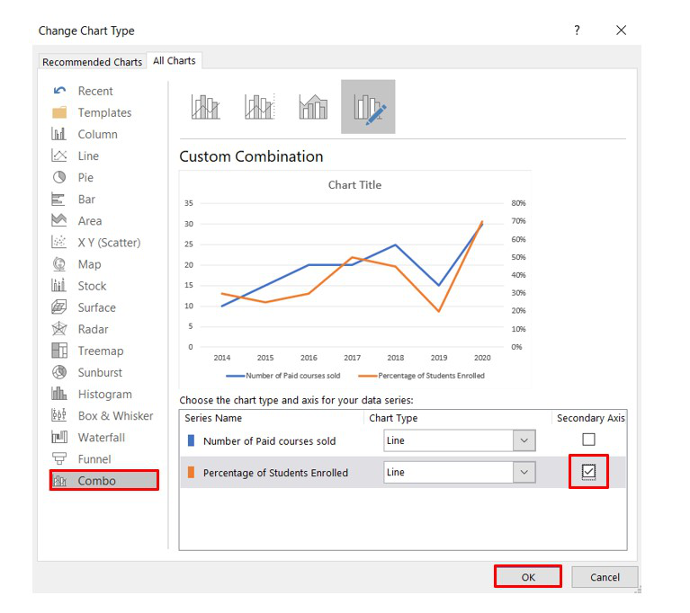
4. Choosing a Different Chart Type for the New Series
Sometimes, to create a clear visual comparison, you might want to change the chart type for the newly added series:
- Right-click the newly added data series.
- Select Change Series Chart Type.
- Choose a different chart type from the options, like a line chart if the base is a bar chart.
5. Adjusting Chart Elements for Clarity
Once you’ve superimposed your graphs, you need to adjust the chart to make it readable:
- Adjust the scale of both axes to ensure the superimposition does not distort the data.
- Use distinct colors, markers, or lines to differentiate the series.
- If necessary, modify the legend, axis labels, and add a chart title to clarify what viewers are looking at.
6. Enhancing the Visual Appeal
To make your graph not only informative but also visually appealing:
- Add data labels for key points if needed.
- Consider using trendlines to illustrate trends within the data.
- Utilize data tables or error bars for more technical presentations.
💡 Note: Keep in mind that not all types of charts should be superimposed. Ensure the chart types you choose to overlay make sense in terms of the data they represent to avoid visual confusion.
Additional Tips for Effective Superimposed Graphs
To ensure your superimposed graphs are not only functional but also impressive, here are some additional tips:
- Select Appropriate Data: Only superimpose data that can logically be compared or that relates to each other. This prevents your graph from becoming cluttered or misleading.
- Consistent Time Frames: If you’re comparing trends over time, ensure the time frames of each data series are consistent.
- Secondary Axis: If the scales of the datasets differ significantly, consider using a secondary axis to prevent data misrepresentation.
- Color Coding: Use distinct colors or patterns to differentiate between data series for easy identification.
When to Use Superimposed Graphs?
Superimposed graphs are particularly useful in various scenarios:
- When comparing trends of different but related data sets over the same time period.
- In financial analysis to show actuals vs. forecasts or different financial metrics simultaneously.
- To visualize part-to-whole relationships with different chart types like pie charts superimposed on bar charts.
In wrapping up this guide on superimposing graphs in Excel, we've explored how this tool can elevate your data presentation. By following the steps and tips provided, you can effectively combine different types of charts to create meaningful, visually compelling narratives from your data. Remember, the key is not just in the visual appeal but in ensuring the story your data tells is clear, accurate, and insightful. This technique empowers you to make informed decisions by seeing patterns and relationships that might otherwise remain hidden.
Can I superimpose any type of chart in Excel?
+Yes, you can superimpose many chart types, but some make more sense than others. Line and bar charts are commonly superimposed, whereas pie charts might not provide clear visuals when layered.
How can I make superimposed graphs more readable?
+Use different colors, markers, or line styles for each series, adjust the scale and axis labels, and ensure the legend is clear. Also, consider using a secondary axis if the data scales differ significantly.
What are the limitations of superimposing graphs in Excel?
+The main limitation is visual clarity; too many data series or inappropriate chart type combinations can make the graph confusing. Also, Excel has a limit on the number of data points you can plot.
Related Terms:
- Overlap analysis Excel
- excel overlay two pie charts
- overlay two charts in excel
- merge two graphs in excel
- merge two charts in excel
- overlapping bar chart in excel


