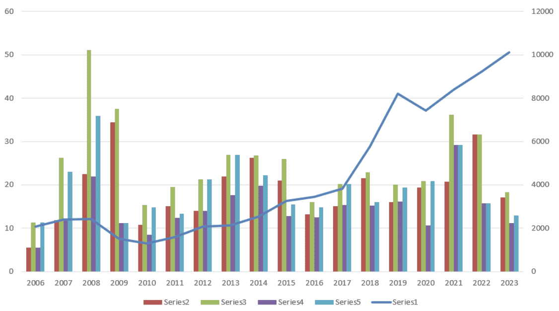
5 Easy Steps to Create a Double Bar Graph in Excel

Creating a double bar graph in Excel is a straightforward process that allows you to compare two sets of data side by side. This visual comparison is incredibly useful for analyzing trends, differences, and proportions within related datasets. Let's dive into the steps required to craft this informative chart with ease.
Step 1: Gather and Prepare Your Data
Before you can start creating your double bar graph, you need to ensure your data is well-organized:
- Arrange your data in columns or rows.
- Ensure each dataset you want to compare is in adjacent columns or rows.
- Include clear labels for your categories and series.
📊 Note: Remember to keep the data for both sets in the same order to prevent confusion in the final graph.
Step 2: Select Your Data
Once your data is ready:
- Highlight the range of data you want to include in your graph. Ensure you’ve included both datasets, their categories, and any relevant labels.
- Make sure not to include any extra rows or columns that might clutter the graph.
Step 3: Insert the Double Bar Graph
Now, with your data selected:
- Go to the ‘Insert’ tab on the Excel ribbon.
- In the ‘Charts’ group, click on the ‘Bar’ chart icon.
- From the dropdown menu, select ‘Clustered Bar’ or ‘Stacked Bar’ depending on the type of comparison you’re aiming for.
Excel will automatically create the graph, and you’ll see two sets of bars side by side, each representing one of your datasets.
⚠️ Note: If your data is in rows instead of columns, remember to check the 'Switch Row/Column' option to adjust the orientation of your bars.
Step 4: Customize Your Graph
With your graph now visible, here’s how you can make it more informative:
- Add Chart Title: Click anywhere on the graph, then click on the ‘Chart Title’ placeholder to rename it to something descriptive.
- Label Axes: Add axis titles by selecting the graph, going to ‘Chart Tools’ > ‘Layout’ > ‘Axis Titles’, and typing in your labels.
- Legend: Click on the legend to move or resize it. If you prefer, you can format the legend to match the colors of your bars.
- Bar Colors: Customize the color scheme by double-clicking on a bar and selecting ‘Fill’ options to change the color.
- Data Labels: Add labels directly on the bars by selecting the graph, then ‘Layout’ > ‘Data Labels’ > ‘Inside End’ or ‘Center’.
🎨 Note: Consistency in color coding helps in understanding the graph at a glance. Use contrasting colors to ensure visual distinction.
Step 5: Finalize and Interpret Your Graph
The last step involves ensuring your graph is accurate, well-labeled, and easy to interpret:
- Check if the axes are scaled appropriately, adjust if necessary.
- Ensure all elements (title, axes labels, legend) are clearly visible.
- Double-check the data sources to ensure no errors or misinterpretations in the visual representation.
In this final step, take a moment to observe the patterns, trends, or discrepancies that your double bar graph highlights. Whether it's comparing sales figures from different regions, tracking progress over time, or analyzing any other two datasets, this type of chart provides an intuitive way to comprehend the data at a glance.
Thus, by following these five easy steps, you've transformed raw data into a compelling visual narrative. A well-crafted double bar graph not only aids in decision-making but also communicates complex information in a simple and engaging format.
What is the difference between a Clustered Bar Graph and a Stacked Bar Graph?
+A Clustered Bar Graph places bars side by side to compare two datasets easily. A Stacked Bar Graph stacks the bars on top of each other, showing the cumulative effect and proportions of each category.
Can I create a double bar graph with more than two datasets?
+Yes, you can. Excel allows you to add more series to your graph by selecting additional data ranges or using the ‘Select Data’ option in the chart tools.
How do I change the scale of the y-axis in my graph?
+Right-click on the y-axis, select ‘Format Axis’, then adjust the minimum and maximum values under the ‘Axis Options’ tab.
Related Terms:
- Double bar graph maker
- Double bar graph example
- Double stacked bar chart Excel
- clustered bar chart maker
- double bar graph calculator
- clustered bar graph maker


