Craft a Supply and Demand Graph in Excel Easily

Creating a Supply and Demand Graph in Microsoft Excel is a fundamental skill for anyone studying economics, business, or finance. This graph provides a visual representation of how the quantity of a good or service supplied by producers meets the quantity demanded by consumers at various price points. By mastering this skill, you'll be able to analyze market dynamics effectively. Here's how you can easily create this graph in Excel, step by step.
Preparation: Collecting Data
Before diving into Excel, ensure you have the following data:
- A range of price levels.
- The corresponding quantities demanded.
- The corresponding quantities supplied.
Step-by-Step Guide to Crafting Your Supply and Demand Graph
1. Entering Data into Excel
Open a new Excel spreadsheet and enter your data:

| Price | Quantity Demanded | Quantity Supplied |
|---|---|---|
| 10 | 20 | 10 |
| 8 | 25 | 12 |
| 6 | 30 | 14 |
| 4 | 35 | 16 |
| 2 | 40 | 18 |
📝 Note: Replace these example values with your actual data.
2. Setting Up the Graph
- Select the data range including headers for price, quantity demanded, and quantity supplied.
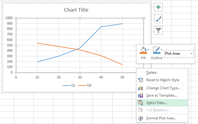
- Navigate to the Insert tab and click on Scatter in the Charts group.
- Choose the “Scatter with Straight Lines and Markers” chart type.
3. Customizing the Graph
After inserting the basic scatter plot:
- Axis Titles: Add titles for both the X and Y axes. The X-axis should represent quantity, and the Y-axis should represent price.
- Series: You should see two lines, one for demand and one for supply. Right-click on each line to change colors, add markers, or modify the line style for visual clarity.
- Chart Title: Click on the default title and rename it to something descriptive like “Supply and Demand Curve for [Product]”.
4. Adding the Equilibrium Point
To mark the equilibrium:
- Identify where the supply and demand lines intersect visually or use Excel’s formulas to find the exact point of intersection.
- Add a new data series for this point or simply insert a marker at the intersection if it’s accurate enough.
- Name this series or marker “Equilibrium Point”.
5. Final Touches
- Adjust your graph size, ensuring it fits well within your report or presentation.
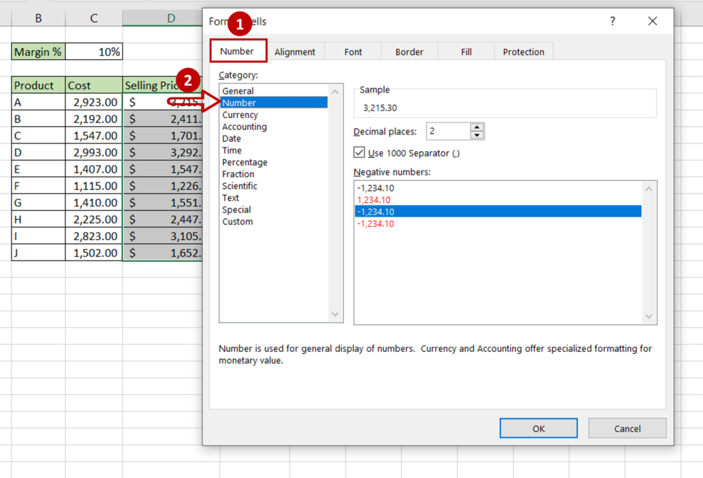
- Consider formatting axis labels for clarity, adding a legend if necessary, and aligning gridlines with your data points for precision.
- Use the “Format Axis” options to ensure your axes are labeled correctly and proportionally scaled.
By following these steps, you have now created an informative and visually appealing Supply and Demand Graph in Excel. This graph not only simplifies complex market analysis but also serves as an essential tool for educational purposes or business presentations.
Tips and Tricks for Enhanced Visualization
- Use trendlines or smoothed lines for demand and supply to indicate the general trend.
- Add dynamic labels or data labels for key points like the equilibrium.
- If your data changes over time, consider using Excel’s animation features or linking the graph to dynamic data sources.
Analyzing supply and demand through this graphical representation helps in understanding market behaviors, making decisions on pricing, production, and marketing strategies, and even predicting future market trends. Excel's powerful charting tools provide an easy-to-use platform for visualizing economic principles in action.
What does the intersection of supply and demand curves represent?
+The intersection of supply and demand curves represents the equilibrium price and quantity. At this point, the amount of goods or services consumers want to buy equals the amount producers are willing to supply at the given price.
Can Excel find the equilibrium automatically?
+While Excel itself does not automatically find the equilibrium point, you can use formulas or add-ins to approximate it by solving the equations for supply and demand or using the Goal Seek feature.
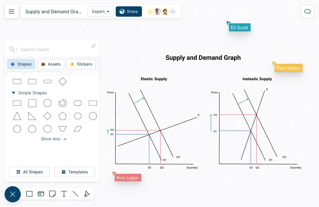
How do shifts in supply or demand affect the equilibrium point?
+Shifts in either the supply or demand curve due to external factors like technology advances, consumer preferences, or natural events will move the equilibrium point. An increase in demand shifts the demand curve right, leading to a higher equilibrium price and quantity. Conversely, an increase in supply shifts the supply curve right, lowering the equilibrium price while increasing quantity.
Related Terms:
- supply and demand chart excel
- demand and supply excel template
- demand curve excel template


