5 Easy Steps to Descriptive Statistics in Excel

In today's data-driven world, understanding descriptive statistics is crucial for making informed decisions across various fields, from business analytics to scientific research. Excel, being one of the most accessible tools for data analysis, provides an intuitive platform to perform these statistics. Here, we will explore five straightforward steps to harness Excel's potential in calculating and presenting descriptive statistics.
Step 1: Preparing Your Data
Before diving into statistics, ensure your dataset is clean and organized:
- Remove duplicates and outliers, if necessary.
- Format your data for analysis by ensuring all similar data points are in a single column or row.
- Convert text to numbers where applicable to avoid calculation errors.
🧠 Note: Always back up your original data before cleaning or making any changes.
Step 2: Basic Descriptive Statistics
Excel has built-in functions for basic descriptive statistics:
- Mean: Use =AVERAGE(range) to compute the average.
- Median: =MEDIAN(range) gives the middle value.
- Mode: =MODE.SNGL(range) finds the most frequent value.
- Standard Deviation: =STDEV.P(range) or =STDEV.S(range) for population or sample standard deviation.
Step 3: Visualizing Data
Visual representation of data can help in understanding its distribution:
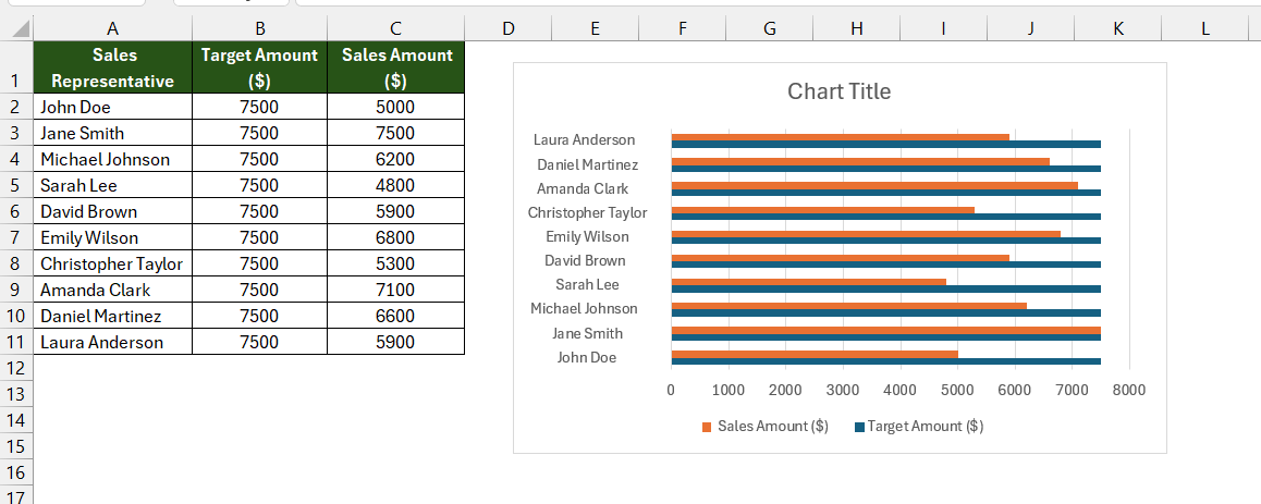
- Use Chart: Insert > Recommended Charts to choose the best fit for your data.
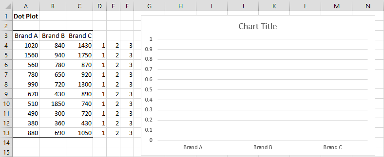
- Create histograms or box plots for distribution analysis.
Example:

| Statistic | Value |
|---|---|
| Mean | =AVERAGE(A2:A100) |
| Median | =MEDIAN(A2:A100) |
🖌️ Note: Choose a chart type that best illustrates the data’s story.
Step 4: Advanced Descriptive Statistics
For a deeper dive into your data:
- Use Data Analysis Add-in:
- Go to File > Options > Add-Ins > Excel Add-Ins.
- Select “Analysis ToolPak” and click “OK.”
- Now, under the Data tab, you’ll find the “Data Analysis” button.
- Select “Descriptive Statistics” from the options and enter your data range.
- Choose summary statistics like skewness, kurtosis, and more.
Step 5: Interpreting Results
Understanding what the statistics mean:
- Mean vs. Median: A significant difference indicates skewness in data distribution.
- Standard Deviation: Reflects the spread of your dataset.
- Skewness: Positive or negative skewness shows data asymmetry.
- Kurtosis: Higher values indicate more outliers or extreme values.
In summary, Excel provides powerful tools to conduct descriptive statistics, making it easier to understand the characteristics of your data. From basic calculations to detailed analysis, the steps outlined help not only in performing these statistics but also in interpreting them for actionable insights. Remember, while Excel simplifies the process, the accuracy of your conclusions depends heavily on the quality of your data and understanding the context of your analysis.
What is the difference between sample and population standard deviation?
+Sample standard deviation (STDEV.S) accounts for a sample of data, whereas population standard deviation (STDEV.P) calculates for the entire population. The former uses n-1 in its formula, providing a better estimate of variance for a population.
Can Excel handle large datasets for descriptive statistics?
+Yes, Excel can manage large datasets, but performance might slow down with extremely large files. Tools like Power Query or Power Pivot in Excel can enhance handling large data volumes.
How does skewness affect data interpretation?
+Skewness tells you about the symmetry of your data distribution. Positive skewness means the tail on the right side of the distribution is longer or fatter, indicating more low values than high. Negative skewness indicates the opposite.
Related Terms:
- Descriptive statistics Excel 2023
- Descriptive statistics Excel multiple columns
- Descriptive Statistics in Excel PDF
- Descriptive statistics in Excel 365
- descriptive statistics in excel instructions
- excel statistical functions cheat sheet


