How To Make A Dot Plot On Excel

Creating a dot plot in Microsoft Excel can be an insightful way to visualize frequency distributions or to highlight key data points. Unlike common chart types like bar or pie charts, dot plots, sometimes known as strip plots or Cleveland dot plots, offer a clean, simple, and highly readable method to compare data across categories. Here's how you can craft an effective dot plot in Excel to showcase your data points:
Understanding Dot Plots
Before diving into the mechanics, let’s clarify what a dot plot is. Essentially, a dot plot is a type of graph where:
- Each value in your dataset is represented by a dot.
- Multiple dots at the same position indicate frequency or occurrences of the same value.
- This visual representation is ideal for small to medium datasets where you want to show distributions or highlight outliers.
Gathering Your Data
The first step in creating a dot plot is preparing your data:
- Organize your data in a single column.
- If your data has categories, ensure these are listed alongside your values.
- Sort your data for better visual analysis if necessary.
Here’s an example of how your data might look:

| Category | Value |
|---|---|
| A | 20 |
| B | 35 |
| C | 20 |
| D | 40 |
Creating the Dot Plot

Follow these steps to generate your dot plot:
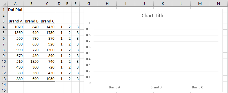
1. Setting Up Your Data for Visualization
- Create helper columns to manage the dot placement:
- Category: This column will hold your category names.
- Value: This column will list the values you want to plot.
- X Pos: This is where you’ll list the horizontal positions of your dots.
- Y Pos: Here, you’ll specify the vertical positions of your dots.
2. Plotting the Dots
- Select your data, including the helper columns.
- Navigate to Insert > Scatter (X, Y) or Bubble Chart > Scatter with only markers.
- Excel will plot the dots where the X and Y values intersect.
3. Formatting the Plot
After plotting, your chart might need some tweaks for clarity:
- Right-click on the chart area to access formatting options.
- Adjust marker size, style, and color to make your dots stand out.
- Label your axes. The X-axis shows values, and the Y-axis should represent categories or frequency.
💡 Note: Ensure your chart's X and Y axes are clearly labeled for ease of interpretation.
4. Enhancing the Plot for Better Understanding
- Category Labels: Add text labels to each category on the Y-axis manually for readability.
- Connect the Dots: Use lines to connect dots if they represent progression or comparison over time or categories.
- Annotations: Add notes or comments on the plot to highlight important points or trends.
💡 Note: For categorical data, connecting the dots can sometimes make the plot misleading if the categories don't have an ordinal relationship.
5. Final Touches
- Set an appropriate chart title.
- If needed, adjust the scale on your axes to better reflect the data distribution.
- Consider using trend lines or error bars for additional insights.
Interpreting Dot Plots
Understanding your dot plot involves:
- Spread of Data: Look at how dispersed or clustered the dots are. This can show variability within categories.
- Frequency: The number of dots at any given value indicates the frequency of that value.
- Outliers: Identify any isolated dots that could be significant in your analysis.
In summary, creating a dot plot in Excel allows you to transform raw data into an intuitive visual format, helping to reveal patterns, trends, and outliers that might be missed in more complex or less visually appealing chart types. The steps outlined here provide a straightforward approach to data visualization that can enhance your data analysis and presentation capabilities, making your data more accessible and understandable to both you and your audience.
What are the benefits of using a dot plot over other chart types?
+Dot plots provide a clear visual representation of data distribution, making it easier to spot outliers, trends, and the frequency of data points. They are particularly useful for smaller datasets and are less cluttered than histograms or box plots.
Can I use dot plots to compare data from different categories?
+Yes, by assigning different colors or patterns to the dots or by adjusting the Y-axis for categorical separation, you can effectively compare data across categories.
How can I make my dot plot in Excel look more professional?
+Use uniform markers, adjust spacing, ensure clear axis labeling, and consider adding a legend if multiple data series are present. Enhancing with trend lines or error bars can also add a professional touch.
Creating dot plots in Excel is not only about enhancing your analytical skills but also about communicating your findings effectively. With these steps, you’re now equipped to use this powerful visualization tool to bring your data to life.
Related Terms:
- Dot Plot diagram Excel
- Frequency dot plot Excel
- Horizontal dot plot Excel
- Dot plot template Excel
- Create a dot plot online
- excel dumbbell chart


