5 Easy Steps to Graph Any Function in Excel

Introduction to Graphing Functions in Excel
Excel is not only a powerful tool for managing data but also for visually representing mathematical functions through graphs. Whether you’re a student learning about functions, an engineer analyzing data trends, or a teacher demonstrating math concepts, knowing how to graph a function in Excel can greatly enhance your productivity. Here, we will walk through five straightforward steps to graph any function in Excel, ensuring you can plot equations effortlessly.Step 1: Set Up Your Data
Before you can graph any function, you need to provide Excel with the data points that will form your graph. Here’s how to do it:Define the Range of X-Values: Decide on the range of x-values you want to plot. For instance, if you’re graphing from -5 to 5, you could choose increments of 0.5 or 1.
Create Your Input Data:
- Type the x-values into a column (say column A from A2 downwards).
- Use the adjacent column (B) to calculate the corresponding y-values.
<table>
  <tr>
    <th>X-Values</th>
    <th>Y-Values (f(x))</th>
  </tr>
  <tr>
    <td>-5</td>
    <td>=SIN(A2)</td>
  </tr>
  <tr>
    <td>-4.5</td>
    <td>=SIN(A3)</td>
  </tr>
  <tr>
    <td>-4</td>
    <td>=SIN(A4)</td>
  </tr>
</table>
- Function Calculation:
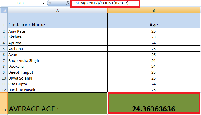
- For sine function, you would use the formula
=SIN(A2)in cell B2 and drag down. - Replace
SINwith the formula for the function you wish to graph.
- For sine function, you would use the formula
📝 Note: Ensure your increments are small enough to accurately represent your function, but keep the number of points manageable to maintain performance in Excel.
Step 2: Create a Basic Line Chart
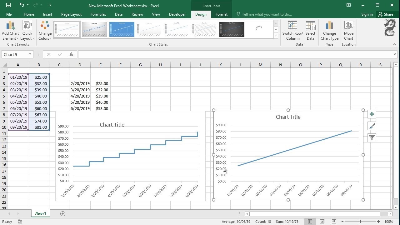
Now that your data is set up:- Highlight Your Data: Select the range of cells that includes both your x and y-values.
- Insert Chart: Go to the ‘Insert’ tab, choose ‘Scatter’ or ‘Line’ Chart, and select the option ‘Scatter with Straight Lines’ or similar.
<p class="pro-note">🌟 Note: A scatter chart with lines is ideal for most mathematical functions to show continuity and trend.</p>
Step 3: Customize Your Graph
To make your graph more informative and visually appealing:- Axis Labels:
- Click on the chart, select the axes, and add labels. For X-axis, you might label it as “x” or the variable name; for Y-axis, use “y” or the function’s output.
- Graph Title: Add a descriptive title, e.g., “Graph of Sin(x)” or “y = f(x)”.
- Formatting:
- Adjust the color of lines or markers, add gridlines, change the scale if necessary, etc.
Step 4: Add Mathematical Functions
If your function involves trigonometric, exponential, or logarithmic functions, here are some functions you can use:SIN(x)for sine functionCOS(x)for cosineLN(x)for natural logarithmEXP(x)for exponentialSQRT(x)for square root
For complex functions:
- Trendline:
- Click on your chart, select ‘Add Chart Element’ > ‘Trendline’ > ‘More Trendline Options’.
- Here, you can choose the type of function to fit (linear, polynomial, exponential, etc.).
🔍 Note: Excel might not support all types of functions out of the box. For highly complex functions, you might need to approximate with simpler formulas or use add-ins.
Step 5: Analysis and Export
Once your graph is complete:- Analysis:
- Examine the graph to draw conclusions about the function’s behavior, points of interest, or trends.
- Export:
- If you need to use this graph outside of Excel, you can copy it or save it as an image or PDF for reports or presentations.
💾 Note: Consider saving your work as an Excel chart template (.crtx) for repeated use with different functions.
After these five steps, you’ll have a professional-quality graph of any function you choose to plot in Excel. The ability to visualize functions helps in understanding mathematical concepts, analyzing data, and even teaching others about the behavior of functions.
Wrapping Up
Graphing functions in Excel is not only educational but also incredibly practical for many real-world applications. From understanding mathematical concepts to business data analysis, Excel provides an accessible platform to represent and manipulate functions visually. By following the steps outlined, you can explore the intricacies of mathematical models, make predictions, or simply demonstrate the beauty of mathematics through graphing. Whether you’re plotting a simple linear equation or complex trigonometric functions, Excel’s tools allow for an intuitive approach to graphical representation, making it an essential skill for any data enthusiast or student.
What if I need to plot multiple functions on the same graph?
+To plot multiple functions on the same graph, follow these steps: - Create separate columns for each function’s y-values. - Select all columns including your x-values, then insert the chart as usual. Excel will automatically plot each function as a separate line on the same graph.
How do I ensure the accuracy of my graph?
+To ensure accuracy: - Use enough data points (smaller increments for smoother lines). - Double-check your function formulas for correctness. - Use the ‘Smooth Lines’ option if available, to get a more visually accurate representation of your function.
Can Excel handle complex mathematical functions?
+Excel can plot most common mathematical functions directly using its built-in functions. However, for very complex or custom functions: - Use Visual Basic for Applications (VBA) to define custom functions. - Approximate with simpler functions or use advanced add-ins.
Related Terms:
- excel add equation to graph
- create graph from formula excel
- plotting equation in excel
- graphing calculator in excel
- draw function in excel
- chart of excel formulas


