Create a Simple Run Chart in Excel Easily

Creating a run chart in Excel is a straightforward way to track changes over time, analyze patterns, and understand the performance of a process or system. Run charts are especially valuable for their simplicity, allowing anyone from business analysts to students to gain insights without needing complex software. Here's how you can create your own run chart in Excel with ease.
What is a Run Chart?
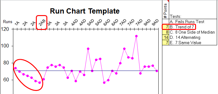
A run chart displays data points in the order they occur, connected with a line to show trends over time. It's used for:
- Tracking performance or changes
- Identifying trends or patterns
- Detecting shifts or cycles in the data
Run charts help in visualizing data to see if there's an improvement, degradation, or stabilization in the process being monitored.
Preparing Your Data
Before we dive into Excel:
- Ensure your data is time-series data. This means you have dates or sequential measurements along with the corresponding values you wish to track.
- Keep your data clean and consistent. Remove any outliers or irrelevant data points.

| Date | Value |
|---|---|
| 01-Jan-2023 | 20 |
| 02-Jan-2023 | 25 |
| 03-Jan-2023 | 18 |
Steps to Create a Run Chart in Excel
Step 1: Open Excel and Input Data
- Open Microsoft Excel.
- Enter your data into two columns:
- Column A for dates or time intervals
- Column B for the values you’re tracking
Step 2: Select Your Data
- Click and drag to highlight your entire data set, including headers.
Step 3: Insert a Line Chart
- From the ‘Insert’ tab, select ‘Insert Line or Area Chart’ > ‘Line with Markers’
Step 4: Customize Your Chart
- Click on the chart to activate the ‘Chart Tools’.
- Add a Chart Title from ‘Chart Layout’ or ‘Design’ tab.
- Set Date Axis if not automatically recognized.
- Adjust the scale and formatting if necessary to better visualize trends.
Step 5: Analyze Your Run Chart
Look for:
- Shifts: Six or more consecutive points either above or below the median line.
- Trends: Five or more consecutive points all increasing or decreasing.
- Cycles: Points that oscillate predictably.
- Points that deviate significantly from the norm.
Important Tips for Effective Run Charts
- Ensure the time intervals between data points are consistent.
- Use mean or median lines to highlight the central tendency.
- Consider adding control limits if you’re comparing against a baseline or standard.
🚀 Note: If your data series is extensive, consider focusing on a specific time range to avoid cluttering the chart.
Interpreting Your Run Chart
Once your run chart is ready, here’s how to interpret it:
- Look for runs: A series of points above or below the median can indicate a shift or trend.
- Analyze the direction of the trend to understand if the process is improving or worsening.
- Pay attention to any unusual patterns or outliers that could suggest special cause variation.
To wrap up, run charts in Excel provide a visual tool for monitoring process changes over time. By following these simple steps, you can quickly create charts that help in spotting trends, shifts, or cycles in your data. Remember that the effectiveness of a run chart lies in its simplicity and the consistency of data collection and analysis. Regularly updating your chart allows you to make informed decisions based on real-time performance, enhancing process control and improvement efforts.
What’s the difference between a run chart and a control chart?
+While both charts track data over time, a run chart simply shows the sequence of data points, whereas a control chart includes additional statistical analysis with control limits to identify when a process is out of control.
Can I use run charts for any type of data?
+Run charts are most effective with time-series data where the progression or trend over time is relevant. However, they can be adapted to other scenarios by considering each data point as a step in a sequence.
How do I decide where to place the median line?
+The median line typically goes through the middle of your data range. You can calculate the median of all your data points or base it on a specific period if the process has evolved over time.
Is there software better than Excel for creating run charts?
+Excel is quite capable for basic run charts, but if you need more advanced statistical analysis or visualization options, software like Minitab, JMP, or specialized packages in R or Python might offer more features.
How frequently should I update my run chart?
+This depends on the nature of the process. For monitoring purposes, update your chart as frequently as the data becomes available (daily, weekly, etc.).
Related Terms:
- Run chart in Excel template
- Run Chart generator
- Control chart Excel
- run sheet template excel
- run chart excel template
- example of a run chart


