Create Excel Pie Charts With Percentages Easily

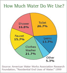
Creating pie charts in Excel with percentages can greatly enhance the visual presentation of data, making it easier to understand proportions at a glance. Whether you're a business analyst summarizing sales figures, a teacher showing class statistics, or a student presenting survey results, pie charts are an effective tool for displaying categorical data. Here's a step-by-step guide on how to create pie charts with percentages in Excel:
Preparing Your Data

Before you can make a pie chart, ensure your data is in a suitable format:
- Organize your data into columns where one column has the categories or labels, and another has the corresponding values.
- Each row should represent a different category and its value.
- Make sure the values are numeric for Excel to calculate percentages correctly.
Creating the Pie Chart

Follow these steps to create a basic pie chart:
- Select your data: Click and drag to highlight the cells containing your categories and values.
- Insert Chart: Navigate to the ‘Insert’ tab, click on ‘Pie’ or ‘Doughnut Chart,’ and choose a ‘2-D Pie’ chart.
- Excel will: Automatically generate a pie chart based on the selected data.
Adding Percentages

To display percentages in your pie chart:
- Right-click: On one of the pie slices to bring up a context menu.
- Choose ‘Add Data Labels’: Select ‘Add Data Labels’ from the menu.
- Change Label Options: Click on the new labels, go to ‘Format Data Labels’, and in the ‘Label Options’ tab:
- Check ‘Percentage’ under ‘Label Contains’.
- Optionally, uncheck ‘Value’ to remove numerical values if not needed.
Customizing Your Pie Chart

Here are some ways to refine your pie chart:
- Colors: Use ‘Format Data Series’ to change colors or add a 3-D effect.
- Exploding Slices: Right-click on a slice, select ‘Format Data Point’, and choose ‘Explode’ to emphasize specific slices.
- Legend Position: Move the legend by right-clicking it and selecting a new position from the ‘Legend Options’.
- Label Position: Adjust label positions through the ‘Label Options’ or manually drag them.
Notes for Best Practices
💡 Note: Keep in mind that pie charts work best with up to seven segments. More than that can make the chart cluttered and hard to read.
💡 Note: Use pie charts for showing parts of a whole, but for comparisons over time or between categories, consider other chart types like bar or line charts.
By following these steps, you'll be able to craft pie charts in Excel that not only present your data but do so in a visually appealing way with clear percentage labels. Pie charts are versatile tools in data visualization, offering a simple way to represent proportions, making it easier for your audience to quickly grasp the essence of your data.
Why should I use percentages in a pie chart?
+
Percentages make it easier for your audience to understand the relative sizes of different segments in your data, providing a quick visual cue on proportions without needing to interpret raw numbers.
Can I add percentages to an existing pie chart?
+
Yes, you can. Right-click on the chart, select ‘Add Data Labels’, then customize the labels to show percentages in the ‘Label Options’ tab.
What do I do if the pie chart looks too crowded with many segments?
+
Consider grouping smaller segments into an ‘Others’ category or using a different chart type like a bar chart for better clarity when dealing with numerous categories.
Related Terms:
- Template pie chart Excel
- Chart pie Excel
- Edit pie chart in excel
- Pie chart percentage
- pie chart to show percentage
- adding percentages to pie chart


