5 Simple Steps to Graph Equations in Excel

Excel is not just a tool for managing data or creating spreadsheets; it's also incredibly powerful for mathematical and graphical analysis. One of the most useful features in Excel for students, educators, and professionals alike is its ability to graph equations. Whether you're plotting a simple linear function or a more complex polynomial, Excel provides a straightforward way to visualize data. Here are five simple steps to help you graph equations in Excel:
Step 1: Setting Up Your Data
Before you can graph an equation, you need to set up your data:
- Open a new Excel worksheet or select a tab in an existing workbook.
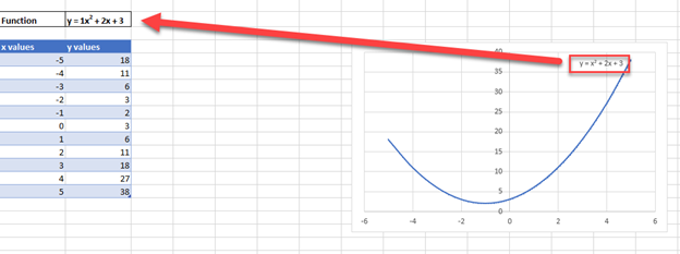
- In the first column (Column A), list the X-values you want to use for your equation. These could range from -10 to 10, or any other range relevant to your equation.
- Next to these X-values (Column B), calculate the Y-values using the equation you wish to graph. Here’s how:
- Click on the first cell in Column B (e.g., B2) and type or click into the formula bar.
- Enter your equation using Excel’s formula syntax. For example, for a simple linear equation like y = 2x + 3, you would type:
=2*A2+3 - Drag the fill handle (the small square in the bottom-right corner of the cell) down to fill the rest of the cells in Column B with the calculated Y-values.
Step 2: Creating the Chart
With your data ready, you can now create a chart:
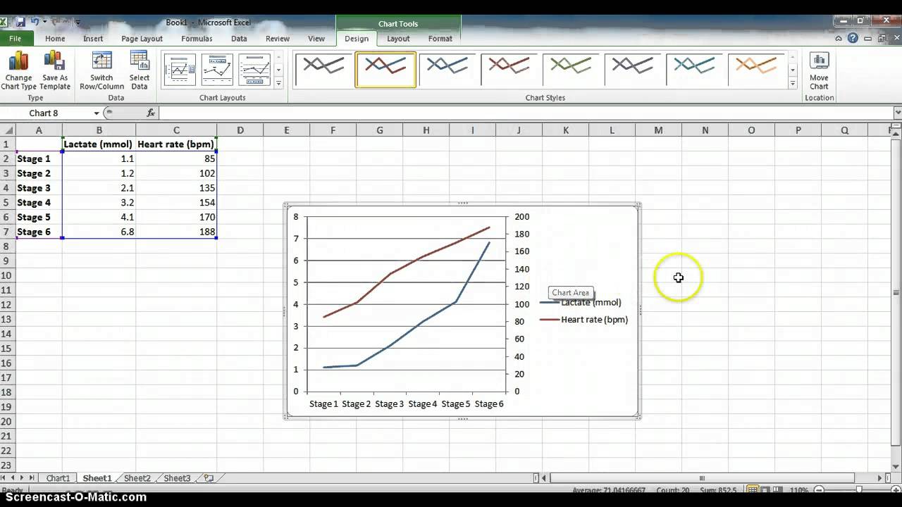
- Select the range of your data, including both X and Y columns.
- Navigate to the Insert tab on the Excel ribbon.
- Under the Charts group, click on Scatter or XY (Scatter) charts, and choose a scatter chart type with smooth lines or markers, depending on your preference.
- Excel will instantly generate a chart plotting your data points.
Step 3: Customizing Your Graph
Customizing the graph makes your equation more visually appealing and informative:
- Add Chart Elements: Click on the chart to activate the Chart Tools. Here you can:
- Add titles for the chart and axes.
- Modify the legend if you’re graphing multiple equations.
- Include gridlines for better readability.
- Format the Data Series: Right-click on the plotted line and choose Format Data Series to change line style, markers, or add a trendline for regression analysis.
- Change Chart Style: Use the Chart Styles option to apply predefined styles or customize the color scheme.
Step 4: Adding More Equations
If you want to graph multiple equations:
- Repeat the process from Step 1 to set up another series of Y-values for the new equation next to your first series in Column B.
- Highlight the new range of data along with the original data to update the chart.
- Change the data series settings to add distinct colors or markers for each equation.
Step 5: Using Advanced Features
Excel offers several advanced features to enhance your graphs:
- Dynamic Equations: If you’re dealing with dynamic variables, you can link your equations to cell values, allowing you to change input parameters and see immediate updates to the graph.
- Error Bars: Add error bars to visually represent uncertainties in your measurements or calculations.
- Data Labels: Include data labels to show specific points’ coordinates directly on the graph.
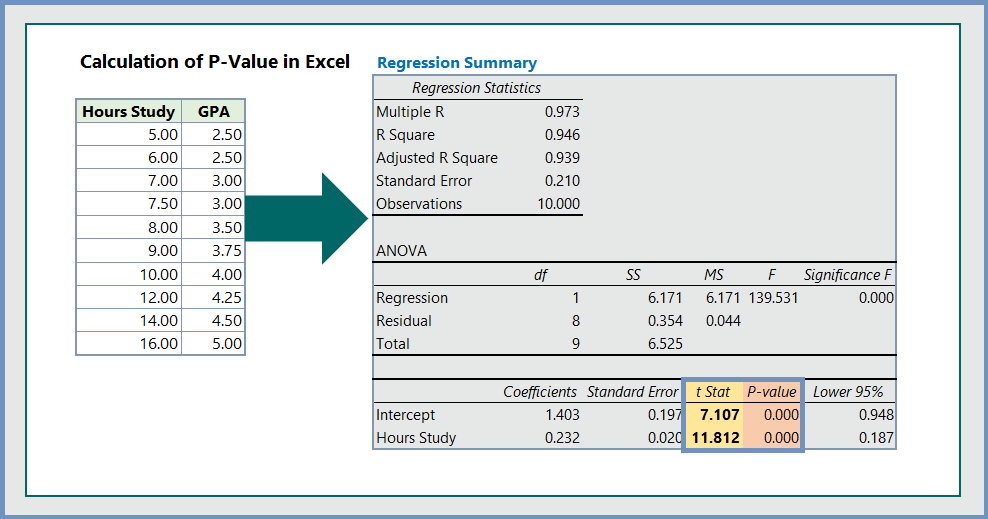
- Trendline Options: Click on a series and choose Add Trendline to include statistical analysis like linear or polynomial fits with corresponding R-squared values.
🌟 Note: When graphing equations in Excel, ensure your X-values are sufficiently dense to capture the nuances of your function, especially for curves with high-order polynomials.
By following these steps, you can transform your mathematical expressions into visual representations, which can be invaluable for presentations, educational purposes, or personal analysis. Excel's flexibility allows you to not only plot basic linear equations but also tackle more intricate functions with ease. Whether you're exploring patterns, teaching, or analyzing data, mastering the art of graphing in Excel can significantly elevate your numerical and visual data interpretation skills.
Can I graph 3D equations in Excel?
+Excel does not natively support 3D graphing, but you can simulate 3D effects by using certain types of charts like Surface Charts or by integrating Excel with other software like MATLAB for true 3D graphing.
How can I update my graph automatically when data changes?
+To have your graph update automatically, ensure that the cells containing your equations are linked to the data in your chart. Excel will dynamically update the graph whenever these cells are recalculated.
What’s the best way to handle complex mathematical functions?
+Complex mathematical functions can be handled by breaking them down into smaller, manageable parts or by using add-ins like the Analysis ToolPak for advanced calculations. Additionally, you might need to increase the number of data points to accurately capture the behavior of the function.
Related Terms:
- Basic formula Excel
- Linear equation in Excel graph
- Chart formula in Excel
- YouTube Excel formula Tutorial
- excel get formula from graph
- display equation on chart excel


