5 Steps to Creating a Double Bar Graph in Excel

Double bar graphs are an excellent tool for comparing two sets of data side by side. Whether you're looking to present sales figures for two different years, compare market share across regions, or illustrate any other comparative data, Excel provides a straightforward way to create these visualizations. In this tutorial, we'll walk through five easy steps to create a compelling double bar graph in Microsoft Excel.
Step 1: Prepare Your Data
Before you can start creating a double bar graph, you need to ensure your data is ready. Here’s how:
- Set up your data in columns with headers. For instance, if you’re comparing annual sales, your columns might look like:

| Product | 2020 Sales | 2021 Sales |
|---|---|---|
| Product A | 500 | 550 |
| Product B | 600 | 620 |
🔍 Note: Ensure each column header is unique and clear, as these will become the labels on your graph.
Step 2: Highlight Your Data
With your data organized:
- Highlight the range of data including headers that you want to include in your double bar graph.
- This selection should include the column headers for proper categorization.
Step 3: Insert the Double Bar Graph
To create the graph:
- Go to the Insert tab on Excel’s Ribbon.
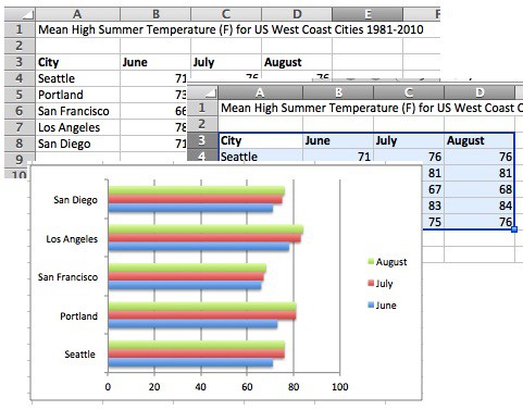
- Click on the Bar Chart icon, then choose Clustered Bar Chart. This option creates two bars next to each other for comparison.
Step 4: Customize Your Graph
Customization is key to making your graph clear and effective:
- Colors: Right-click on any bar to change its color. Use contrasting colors for clarity in comparison.
- Axis Titles: Add titles to your axes to explain what each axis represents.
- Legend: Excel should automatically create a legend, but you can customize it or remove it if it’s not needed.
- Labels: Data labels can be added to show exact values on each bar. Right-click the bar and select Add Data Labels.
- Adjust Layout: Use the Chart Tools to adjust the size, layout, and positioning of your graph.
📚 Note: Keep your graph design simple to ensure readability. Overcomplicating with too many colors or elements can obscure the data’s message.
Step 5: Final Review and Adjustments
Before sharing your graph:
- Check for readability. Are the labels and legend clear?
- Ensure the comparison is meaningful. If one bar dwarfs the other significantly, consider using a log scale or break the y-axis.
- Test for colorblindness if your audience might include colorblind individuals by using patterns or shades instead of colors for distinction.
- Save your work, as Excel does not always keep customizations when you reopen the file.
Creating a double bar graph in Excel allows you to present data comparisons visually, making it easier for your audience to understand complex information at a glance. These graphs are particularly useful for highlighting trends, anomalies, or the effectiveness of strategies over time. By following these steps, you've learned how to set up your data, insert a graph, and customize it for maximum impact. Whether for business presentations, academic research, or personal projects, mastering this visualization tool can enhance the way you communicate data insights effectively.
Can I change the bar width in a double bar graph?
+Yes, you can adjust the width of bars in your graph by selecting the bars, then accessing the Format Data Series options where you can modify the gap width and the series overlap.
How do I add more than two sets of data to my graph?
+To include more than two sets of data, you can add more columns to your data range before inserting the graph, or right-click the graph after creation and add more data series from the context menu.
Is there a way to make my double bar graph dynamic?
+Yes, by using Excel’s table feature or named ranges, your graph can update automatically as you add more data. This makes your visualizations dynamic and reduces the need for manual updates.
Related Terms:
- Double bar graph example
- Double stacked bar chart Excel
- clustered bar chart maker
- double bar graph calculator
- clustered bar graph maker
- dual bar chart maker


