5 Easy Steps to Create a Dot Plot in Excel

Why Use Dot Plots in Excel?
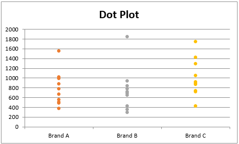
Data visualization is an essential part of conveying complex information in an easily digestible format. Among various types of charts and graphs, dot plots offer a unique visual representation that stands out for its simplicity and effectiveness. They are especially useful for:
- Displaying distributions or patterns in a dataset.
- Comparing frequencies or counts without the clutter of axes or bars.
- Showing categorical variables with a high degree of clarity.
- Identifying outliers or anomalies in the data.
Step 1: Prepare Your Data
Before you start creating your dot plot, ensure your data is organized in a way that will facilitate plotting. Here’s what you should do:
- Structure Your Data: Place your categories or labels in one column, and the corresponding numerical values in another.
- Example:

Category Value Apples 5 Oranges 3 Bananas 7 - Data Cleaning: Ensure no empty cells or non-numeric entries exist in the value column.
✏️ Note: For large datasets, consider sorting or filtering data to visualize only the necessary information.
Step 2: Insert a Scatter Plot
Excel doesn't have a direct option for a dot plot, so we'll use a Scatter plot as a base:
- Select your data including headers.
- Go to the "Insert" tab on the Ribbon.
- Click on "Scatter" and choose the "Scatter with only Markers" option.
Step 3: Customize the Plot
Here are the customizations you should make to turn your scatter plot into a dot plot:
- Adjust the Axes: Right-click on the horizontal axis, choose "Format Axis", and set the minimum and maximum to match your data range. Ensure that the "Interval between labels" is set to 1 for a clear view.
- Remove Gridlines: This gives a cleaner look, emphasizing the dots.
- Change Marker Styles: Right-click on any data point, select "Format Data Series", and customize the dot size, color, and style to make them more visible.
- Labels: If you need labels for each dot, consider using Data Labels or add them manually.
Step 4: Add Additional Features
Depending on your presentation needs, you might want to:
- Add a Trendline: To show the overall trend or pattern in your data.
- Include Categories: If you're comparing groups, you can add category labels.
- Use Color Coding: To distinguish between different data series or highlight important points.
Step 5: Finalize and Analyze
Once your dot plot is created, take these final steps to refine and interpret your data:
- Check for Outliers: Identify any dots that fall outside the main cluster for further analysis.
- Interpret Patterns: Look for concentrations of dots, gaps, or any other patterns that emerge.
- Save Your Work: Ensure to save your Excel file with the dot plot for future reference or presentations.
Through these steps, you’ve learned how to effectively use dot plots to visually communicate your data, making it easier for your audience to understand and analyze the information at hand.
Creating a dot plot in Excel not only enhances your data presentation skills but also makes your findings more accessible to everyone who engages with your work. Remember, the key to effective data visualization is not just about making charts but making charts that tell a story. Dot plots, with their simple yet powerful visual representation, are an excellent tool in your Excel toolkit for data analysis.
Can I create a dot plot with more than one series of data?
+Yes, you can add multiple series to your dot plot. Just prepare your data with multiple columns for different series, and plot them onto the same scatter chart.
How can I make my dot plot more visually appealing?
+To enhance visual appeal, consider adjusting colors for dots, changing marker styles, and adding a light background to make the dots stand out. Ensure your chart title, axis labels, and any data labels are clear and legible.
What if my data is not numeric?
+If your data is categorical, you can still use a scatter plot. Assign a numeric value or ordinal scale to your categories, then plot as usual. You can then label the dots with the original categorical data for clarity.
How do I handle large datasets in Excel?
+Excel can struggle with very large datasets. Consider using Data Analysis Tools or Power Query for preprocessing. Also, filtering or sorting your data before plotting can help manage visualization of large datasets.
Can I export my dot plot for use in other applications?
+Yes, you can save your dot plot as an image or copy it into other software. Use the “Save as Picture” option in Excel to export your chart for use in documents or presentations.
Related Terms:
- Vertical dot plot Excel
- Create a dot plot online
- Horizontal dot plot Excel
- Dot Plot diagram Excel
- Frequency dot plot Excel
- connected dot plot excel


