Creating a Frequency Chart in Excel Easily

If you're looking to visualize and analyze how often data values occur in your dataset, a frequency chart in Microsoft Excel is an excellent tool to use. Frequency charts provide insight into the distribution of values, which is crucial for understanding patterns and making informed decisions based on data analysis. Here's an easy step-by-step guide on how to create a frequency chart in Excel, ensuring you harness the power of data visualization to its fullest potential.
Understanding Frequency Charts
Before diving into the creation process, it’s worth understanding what a frequency chart is. A frequency chart, also known as a histogram, shows the frequency of occurrence of data values within a specific range of values (bins). This graphical representation helps you identify:
- The distribution of your data
- The central tendency (mean, median, mode)
- Variability (range, interquartile range)
- Any outliers or skewness in the data
Collecting and Preparing Your Data
The first step in creating a frequency chart is to ensure you have your data ready.
- Gather your data: Make sure all your data is in one column for easy analysis.
- Clean your data: Remove any blank cells or non-numeric values which might skew your results.
⚠️ Note: The accuracy of your frequency chart depends on the quality of your data. Always double-check your dataset for errors before proceeding.
Setting Up Bins
Bins are intervals into which your data will be grouped. Here’s how to set them up:
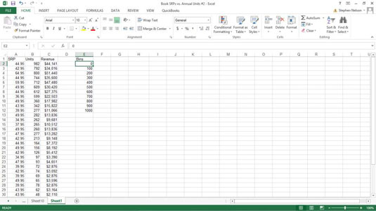
- Create a new column next to your data titled ‘Bins’.
- Determine the range of your bins:
- Find the minimum and maximum values in your dataset.
- Choose a suitable bin size or number of bins. There are various rules for this, like the square root rule or Sturges’ formula, but you can also use your judgment.
- Enter the bin values in ascending order in the ‘Bins’ column.

| Data Value | Bins |
|---|---|
| 10 | 0-10 |
| 15 | 11-20 |
| 25 | 21-30 |
| 35 | 31-40 |
Using the FREQUENCY Function
Excel’s FREQUENCY function calculates how many times values occur within each bin range. Here’s how to use it:
- Select the cell range for your frequency data, which should be one cell longer than the number of bins (to capture values above the highest bin).
- Go to the ‘Formulas’ tab, click ‘More Functions’, ‘Statistical’, and select ‘FREQUENCY’.
- In the function arguments dialog:
- Enter your data range in the ‘Data_array’ field.
- Select your bin range for the ‘Bins_array’ field.
- After setting these parameters, press ‘Ctrl+Shift+Enter’ to complete the function and fill the selected range with frequency data.
💡 Note: Remember to use Ctrl+Shift+Enter instead of just Enter. This creates an array formula, which is essential for the FREQUENCY function to work correctly.
Creating the Chart
With your frequency data in place, here’s how to convert it into a chart:
- Select the range containing your frequency data (excluding the ‘Total’ row).
- Go to the ‘Insert’ tab, and under ‘Charts’, choose the type of chart. For a frequency distribution, a Column Chart or Histogram Chart is usually best.
- Excel will automatically generate the chart. You can then:
- Modify the chart title to be more descriptive.
- Adjust the axis labels.
- Change colors or chart style to suit your presentation needs.
Enhancing Your Frequency Chart
To make your chart more informative and visually appealing:
- Label Data Points: Click on your chart, go to ‘Chart Tools’, ‘Layout’, and choose ‘Data Labels’ to add value labels.
- Adjust Scale: Ensure your scale is correct to reflect the frequency accurately. This can be done under ‘Chart Tools’ > ‘Axes’ > ‘Vertical Axis’ or ‘Horizontal Axis’.
- Legend and Title: Add or remove legends and chart titles to minimize clutter and focus on essential information.
🎨 Note: A visually appealing chart not only looks better but also communicates data more effectively. Keep the design simple and clean to avoid confusion.
To conclude, Excel’s frequency charts are powerful tools for data visualization. They enable you to quickly understand the distribution of your data, identifying trends and anomalies. Through collecting data, setting up bins, using the FREQUENCY function, and then creating a visually appealing chart, you can gain insights that would be difficult to perceive from raw data alone. Remember, the key to a good frequency chart lies in the careful preparation of data and thoughtful presentation of the visual output. This method not only improves data comprehension but also aids in making informed decisions based on the frequency distribution of your data.
Why do I need a frequency chart?
+Frequency charts help in understanding the distribution of data, identifying trends, central tendencies, and variability. They are crucial for statistical analysis and decision making in various fields like finance, education, marketing, etc.
Can I create a frequency chart without using bins?
+Yes, you can create a frequency chart without predefined bins using Excel’s built-in histogram chart type, which automatically bins your data. However, using bins gives you more control over how the data is grouped.
What if my data contains non-numeric values?
+Non-numeric data should be removed or converted to a numeric form before creating a frequency chart. Excel’s FREQUENCY function requires numeric data for accurate analysis.
Related Terms:
- Relative frequency Excel
- Frequency chart Excel
- FREQUENCY formula Excel
- Frequency distribution
- Frequency table maker
- excel calculate distribution of values


