Creating Easy Dot Plots in Excel: A Simple Guide

Excel is a powerful tool for data visualization, offering a plethora of chart types to suit various needs. One lesser-known but incredibly useful type of chart for displaying frequency distributions, trends, or simple comparisons is the dot plot. Dot plots are excellent for representing small datasets where the values are distinct, making it easy for viewers to identify each data point. In this guide, we'll walk you through how to create dot plots in Excel step by step.
Understanding Dot Plots

A dot plot displays individual data points across a single axis, making it clear to see the frequency or occurrence of each value. Here are some key benefits of using dot plots:
- Clarity: Each data point is represented by a dot, making the chart very readable.
- Simplicity: Ideal for small data sets or when exact values need to be presented without overwhelming the viewer with lines or bars.
- Versatility: Can be used for categorical, ordinal, or numerical data.
How to Make a Dot Plot in Excel
Step 1: Prepare Your Data
Before you start plotting, ensure your data is organized:

| Category | Values |
|---|---|
| Brand A | 15 |
| Brand B | 18 |
| Brand C | 10 |
| Brand D | 12 |
Step 2: Set Up the Chart
- Select your data range including headers.
- Go to the Insert tab on the Ribbon.
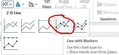
- Click on Insert Scatter (X, Y) or Bubble Chart and then select Scatter with only markers.
🔥 Note: You might need to adjust the axis settings to fit your data range better.
Step 3: Customize the Dot Plot
Now that you have a basic scatter plot, let’s make it into a true dot plot:
- Right-click on any data point and choose Format Data Series.
- Select Marker Options and adjust the size and style of your markers to make them more visible.
- Add labels by right-clicking on the axis and selecting Add Axis Titles. Name your axes appropriately.
- Customize the chart’s appearance through color, font, and gridline settings to enhance readability.
Here is how your settings might look:
- Marker Options: Size increased to 10, style changed to circle.
- Legend: Removed if not needed, or positioned at the top for clarity.
- Y-axis: Categories from your data.
- X-axis: Numerical values.
Advanced Customization
For those wanting to add more sophistication to their dot plots:
- Conditional Formatting: Change marker colors based on values or conditions within your data.
- Multiple Data Series: Add more series to your plot by selecting and adding additional data ranges.
- Error Bars: Include to show variance or confidence intervals if applicable.
- Labels: Add data labels to each point or use a trendline to show overall trends.
To sum up, dot plots are an excellent choice for visual data analysis in Excel, especially when you want to highlight individual data points. They can be created with minimal effort and offer clear, concise visual information about your dataset. By following these steps, customizing your chart, and perhaps experimenting with more advanced options, you can make your data come to life in a simple yet informative way.
Why should I use dot plots instead of other charts?
+Dot plots are ideal for showing individual data points in a clear, uncluttered way, especially when you’re dealing with small datasets or when each point’s value is important.
Can I create a stacked dot plot in Excel?
+Yes, you can create a stacked dot plot by adjusting the Y-axis to stack categories and modifying the marker settings to reflect stacked data points.
What if I have categorical data instead of numerical?
+You can still use dot plots. Assign numerical values or use text labels on one axis to represent different categories, with dots indicating frequency or occurrence.
Related Terms:
- Vertical dot plot Excel
- Dot plot template Excel
- Dot Plot diagram Excel
- Horizontal dot plot Excel
- Dot plot tool
- Bar chart with dots Excel


