5 Easy Steps to Build a Standard Curve in Excel

When you work in a lab or in any field that requires quantitative analysis, the standard curve is a fundamental tool. It helps correlate the concentration of a substance with its signal in a given analytical method. Excel, known for its calculation prowess, is an ideal platform for plotting these curves. Here's how you can craft a standard curve in five straightforward steps.
Step 1: Collect Your Data
First things first, you need to have your data ready. Here’s what you’ll need:
- Known Concentrations: These are the standard solutions whose concentrations are predetermined.
- Measured Signals: Depending on your method, this could be absorbance, fluorescence, or any other quantifiable response.
Here’s an example of how your data might look:

| Concentration (mg/L) | Signal (Absorbance) |
|---|---|
| 0 | 0.000 |
| 5 | 0.098 |
| 10 | 0.196 |
| 25 | 0.470 |
| 50 | 0.934 |
🧪 Note: Ensure that your standard solutions cover the expected range of concentrations for your samples to make accurate interpolations.
Step 2: Prepare Your Excel Worksheet
Start by opening Excel and setting up your data:
- In column A, label your known concentrations as “Concentration.”
- In column B, label your measured signals as “Signal.”
- Input your data points into these columns.
Step 3: Plotting the Standard Curve
Now comes the fun part: plotting your data:
- Select your data (both columns A and B).
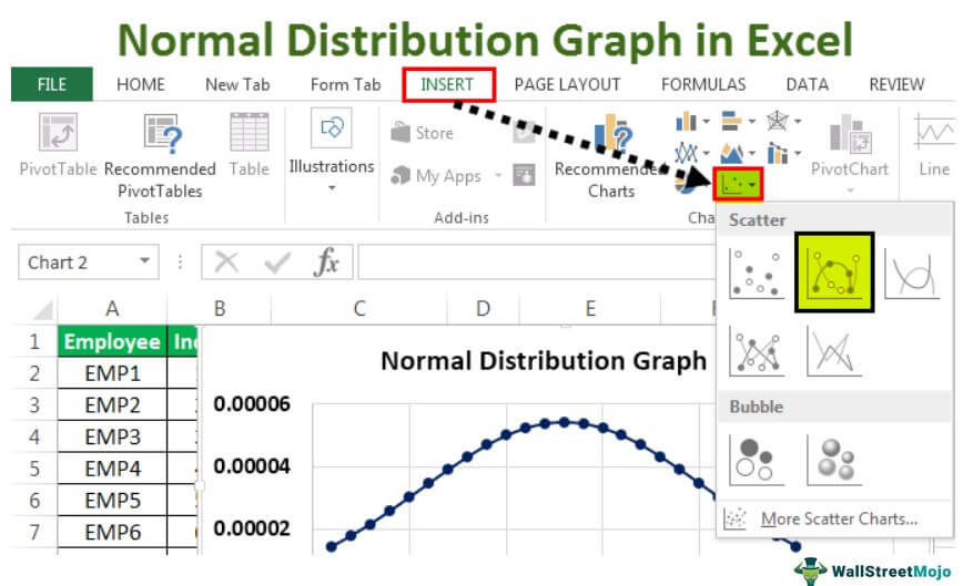
- Navigate to the ‘Insert’ tab, choose ‘Scatter’ or ‘XY (Scatter)’ from the ‘Chart’ group.
- Opt for a scatter plot with smooth lines (without markers), although markers can help identify data points for reference.
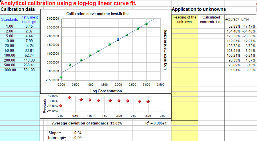
Your chart should now appear with the x-axis representing concentrations and the y-axis showing signals.

Step 4: Adding a Trendline
The trendline will give you the mathematical equation for the relationship between your concentration and signal:
- Right-click on any data point within your chart.
- Select ‘Add Trendline.’
- Choose the trendline type that best fits your data; usually, a linear trendline works for most standard curves.
- Check the box for “Display Equation on chart” and “Display R-squared value on chart.”
Your chart should now display a line that best fits your data, along with the equation and R-squared value indicating how well the line represents your data points.
Step 5: Using Your Standard Curve for Quantification
With your standard curve plotted, you’re ready to use it:
- Any new sample with an unknown concentration can now be quantified by measuring its signal.
- Use the trendline equation to solve for the unknown concentration. Plug in your signal value (y) into the equation to find the concentration (x).
🧪 Note: The R-squared value gives you an indication of how well your data points follow the line. A value close to 1 indicates a good fit.
By following these steps, you've created a standard curve in Excel, a useful tool that can be applied in various scientific research, quality control, or any analytical work that requires quantification. Always remember to validate your curve, check the linearity, and ensure your sample measurements fall within your standard curve's range for accurate results.
With this basic understanding, you can now apply, adapt, and refine this process to fit your specific needs, whether that be in environmental testing, pharmaceuticals, or any field requiring precise quantification.
Can I use a standard curve for non-linear relationships?
+Yes, although most standard curves follow a linear relationship, you can apply polynomial, logarithmic, or other types of trendlines if your data suggests a non-linear pattern.
How many standards should I use to make an accurate curve?
+A minimum of five points is advisable for a good standard curve. This helps ensure accuracy, especially if you need to interpolate between data points.
What do I do if my standards have a signal less than my unknown samples?
+If your standards give signals lower than your samples, you might need to dilute your samples or prepare more concentrated standards to cover the range of your sample concentrations.
Is the standard curve method applicable only to spectrometry?
+No, the standard curve method can be used with many different techniques like HPLC, ELISA, ICP-MS, etc., where a measured response is proportional to concentration.
Related Terms:
- Standard curve graph generator
- Standard curve calculator
- Standard curve excel template
- standard curve graph maker
- standard curve in excel tutorial
- qpcr standard curve excel


