5 Easy Ways to Merge Excel Charts

Working with data in Microsoft Excel can sometimes feel like piecing together a puzzle. When it comes to visualizing data, merging charts is an effective way to present information clearly and dynamically. Whether you’re compiling various data sets or tracking multiple variables, merging Excel charts can elevate your data presentation. Here are five easy ways to merge Excel charts and streamline your reporting process.
Method 1: Overlaying Two or More Charts
This method is particularly useful when you want to compare datasets directly on the same axis.
- Create the first chart by selecting the data and inserting the chart type of your choice.
- Create the second chart using another set of data on the same worksheet.
- Select the second chart, copy it, and paste it on top of the first chart.
- Right-click on the chart area and choose “Select Data.” Here, you can edit the series to ensure they display on the same axis.
- Adjust chart types or colors for clarity and to highlight the merged data.
⚠️ Note: This method works best with charts that share the same scale. Misaligned scales can lead to confusion or misleading data visualization.
Method 2: Using a Combo Chart
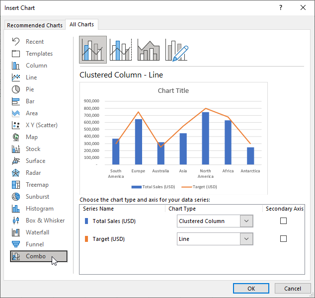
Combo charts allow you to combine different chart types into one, perfect for showing different measures or categories.
- Select the data for your primary chart and insert a chart type, like a bar chart.
- With the chart selected, click on “Change Chart Type” under the “Design” tab.
- Choose “Combo” and select a secondary chart type for the additional series, then decide how you want to display each series (e.g., as columns, lines).
- Adjust settings like axis labels, colors, and other elements to refine the merged chart.
Method 3: Grouping Charts
Instead of merging charts, sometimes grouping can serve the same purpose:
- Create each chart individually in Excel.
- Position them adjacent to each other on the same worksheet.
- Right-click on the chart, choose “Format Chart Area,” and under “Size & Properties,” select “Move and size with cells” to group charts together.

| Chart Type | Use Case |
|---|---|
| Bar/Column | Comparing quantities or categories |
| Line | Tracking trends or changes over time |
| Pie | Displaying proportions within a whole |
Method 4: Embedding Charts in a Dashboard
Dashboards are an excellent way to present multiple charts interactively:
- Create each chart on different sheets or areas of the workbook.
- Use Excel’s Camera tool to capture snapshots of the charts.
- Arrange these snapshots on a new worksheet to create your dashboard layout.
- Link the charts so that updates in the source data reflect on the dashboard.
Method 5: Merging Data Before Charting
This method involves pre-processing your data:
- Combine your data into a single range or table using functions like
VLOOKUP,INDEX, orMATCH. - Create a new chart based on the merged dataset, ensuring that the structure supports the chart type.
- Adjust chart properties and formatting to present the merged data effectively.
💡 Note: When merging data, ensure that the formats and data types are consistent to avoid errors in data interpretation or chart creation.
Integrating different charts in Excel not only enhances the visual appeal of your data presentations but also facilitates better data analysis. Each method offers its unique benefits:
- Overlaying charts allows for a direct comparison of datasets.
- Combo charts let you visually separate different kinds of data in one chart.
- Grouping charts keeps related visualizations in one view.
- Embedding charts in dashboards creates an interactive and organized workspace.
- Merging data before charting simplifies the process but requires data alignment.
These methods empower you to tell a clearer, more compelling story with your data. Whether you're presenting financial reports, tracking project metrics, or analyzing customer behavior, merging charts in Excel provides a pathway to insightful and dynamic reporting. With practice, these techniques will become second nature, allowing you to turn raw numbers into meaningful insights.
Can I merge charts from different Excel files?
+Yes, you can merge charts from different Excel files by either copying the charts directly into your target workbook or by consolidating the data before creating the chart.
What’s the easiest way to update data across multiple charts?
+The simplest method involves linking data ranges through named ranges or using dynamic ranges, ensuring all charts automatically update when the source data changes.
How can I ensure that my merged charts look professional?
+Pay attention to color schemes, use consistent fonts, align charts neatly, and consider using a chart template for uniform style across your visualizations.
Related Terms:
- Merge Excel files macro
- Merger Excel
- Merge sheet Excel
- Docsoso excel
- combining two charts excel
- combine two charts into one


