Print Excel Charts: Step-by-Step Guide for All Users
Understanding Excel Charts
Excel charts are powerful visual representations of data, designed to make complex information more digestible. They help in:
- Spotting trends: By plotting data over time, charts reveal patterns or trends that might not be apparent in raw data.
- Comparing data: Charts enable the comparison of different data sets or categories, showcasing variances, and similarities.
- Communicating results: Charts provide a visual summary of your data analysis, making it easier to present and discuss findings with colleagues, clients, or stakeholders.
Types of Excel Charts
Excel offers an array of chart types to cater to different data analysis needs:
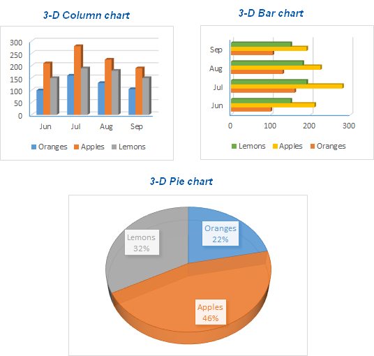
| Chart Type | Best For |
|---|---|
| Column Chart | Comparing values across categories. |
| Line Chart | Showing trends over time or continuous data. |
| Pie Chart | Displaying proportions or percentages of a whole. |
| Bar Chart | Comparing quantities when categories have long names or data sets are extensive. |
| Scatter Chart | Plotting relationships between two numerical variables. |
| Area Chart | Emphasizing the magnitude of change over time. |
Step-by-Step Guide to Creating a Chart
1. Prepare Your Data
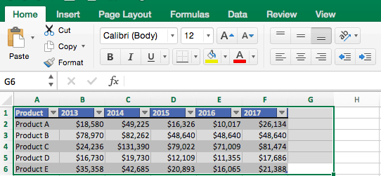
Start by ensuring your data is neatly organized. Each column or row should represent a variable, and rows below or columns to the right should contain corresponding values. Clean your data: Remove any blank rows or columns, correct any errors, and make sure each cell contains only one value.
2. Select Your Data
Click and drag over the data you want to chart. If you’re charting multiple series, ensure all relevant data is highlighted. For larger datasets, you might want to use the Name Box or the Select Data dialog.
3. Insert the Chart
Navigate to the Insert tab and choose your chart from the Charts section. Here, Excel will show recommended charts or allow you to pick from various types like Column, Line, or Pie:
- Click on your preferred chart type.
- Excel will instantly insert a preview chart onto your worksheet.
4. Customize Your Chart
Right-click the chart to access customization options:
- Change Chart Type: Switch to a different chart type if needed.
- Format Data Series: Adjust line style, fill colors, or modify how the data is displayed.
- Add Titles: Provide a chart title, axis labels, or legend descriptions.
- Modify Axis: Control axis scales, labels, or remove the axis if necessary.
- Apply Styles: Choose from predefined chart styles or manually adjust colors and fonts.
🌟 Note: While Excel's recommended charts often choose the best visualization for your data, always consider the message you're trying to convey and adjust the chart accordingly for maximum impact.
5. Print Your Chart
Printing your chart can be straightforward:
- Select the chart or charts you want to print.
- Go to File > Print. Here, you’ll see your chart previewed on the page.
- Choose Print Selected Chart to print just the chart or Print Entire Sheet if you want to include the chart and data.
- Adjust print settings like page orientation, chart size, or margins if needed.
- Press Print to generate a hard copy.
Now you have a clear, professional chart ready to share with your team, present in a meeting, or use for any data-driven decision-making.
Wrapping Up
The key to effectively using Excel charts lies in understanding their purpose, selecting the right type, and customizing them to emphasize your data’s story. Remember, charts are not just about visual appeal but also about clarity, making complex information more accessible. By following this guide, you’re now equipped to create, customize, and print charts that can significantly enhance your data analysis presentations or reports. Whether you’re tracking sales, financial data, or any other metrics, Excel charts will become an invaluable tool in your analytical toolkit.
What is the difference between a column chart and a bar chart?
+The primary difference between a column chart and a bar chart is the orientation. A column chart displays data vertically, whereas a bar chart presents data horizontally. Use a column chart when you’re working with smaller categories or time series data, and use a bar chart for larger category labels or when the vertical space is limited.
How can I ensure that my chart looks good when printed?
+To ensure your chart looks good when printed, consider adjusting the chart size, the scale of axes, and the font sizes before printing. Use the Print Preview feature to see how the chart will appear on paper, and tweak margins and orientation settings in the Print dialog box for optimal layout.
Can I add data labels to my chart?
+Yes, adding data labels to your chart can make it more informative. To do this, right-click on the chart, select Add Data Labels, and choose where you want these labels to appear. You can also customize the label format for clarity or visual appeal.
What if my chart doesn’t fit on one page when printing?
+If your chart doesn’t fit on one page, you can try:
- Reducing the chart size.
- Changing to landscape orientation.
- Adjusting print margins.
- Or, print the chart on multiple pages by selecting Print to Fit in the print options.
Can I print multiple charts at once?
+Yes, you can print multiple charts at once by selecting all the charts before accessing the Print menu. You might need to arrange your charts on a separate worksheet or adjust print settings to fit multiple charts onto a page effectively.
Related Terms:
- Chart printing near me
- print excel graph full page
- excel make graph entire sheet
- excel chart printing cutting off
- print only chart in excel
- graph printing in excel
