Overlay Graphs in Excel: A Step-by-Step Guide

In today's data-driven world, graph overlay in Excel is a powerful technique to compare different datasets visually. Whether you're analyzing financial trends, scientific data, or any other metrics, overlaying graphs can provide immediate insights through correlation and comparison. This comprehensive guide will walk you through the process of creating and customizing graph overlays in Microsoft Excel, from basic setup to advanced customizations, ensuring that you can achieve professional-quality data visualization.
Getting Started with Overlay Graphs in Excel
1. Preparing Your Data
The first step in creating an overlay graph is ensuring your data is organized:
- Column Headers: Ensure your datasets have clear headers.
- Data Compatibility: Datasets should have compatible axes for meaningful comparison.
- Data Range: Check that all datasets cover the same time or category range.
💡 Note: Excel works best when data is formatted in a tabular structure.
2. Selecting the Graph Type
Here are the graph types you can overlay in Excel:

| Graph Type | Best For |
|---|---|
| Line Chart | Trends over time, continuous data |
| Scatter Plot | Correlation between two variables |
| Bar/Column Chart | Comparative analysis of categorical data |
💡 Note: Choose the graph type that best represents your data’s relationship or comparison goals.
3. Creating the Base Graph
- Select your primary dataset by highlighting the data range.
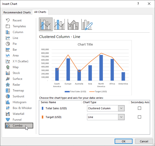
- Go to the ‘Insert’ tab, choose your preferred graph type from the ‘Charts’ section.
- The graph will appear with your selected data.
Overlaying Additional Graphs
4. Adding New Data Series
- Click on the chart to activate the Chart Tools.
- Under ‘Design’ > ‘Select Data’, click ‘Add’ in the ‘Legend Entries (Series)’ section.
- Select your new dataset and click ‘OK’.
5. Customizing the Overlay
Customization is key to making your graph readable and informative:
- Color Coding: Use distinct colors or patterns for each data series.
- Legend Placement: Adjust the legend to avoid overlapping with data points.
- Axis Adjustment: Ensure both primary and secondary axes are aligned for accurate comparison.
- Chart Title: Add or modify the title to reflect the content and purpose of your graph.
💡 Note: Keep in mind that too many data series can clutter your graph, reducing clarity.
Advanced Techniques for Graph Overlay
6. Using Secondary Axis
When datasets have different units or scales:
- Right-click on a data series and select ‘Format Data Series’.
- Choose ‘Secondary Axis’ to add another vertical axis on the right side of your chart.
7. Implementing Dynamic Labels
To make your graph interactive or for real-time data updates:
- Data Labels: Add labels to your data points for instant value recognition.
- Dynamic Formulas: Use Excel’s functions to create dynamic labels that update with data changes.
8. Smoothing Lines
For datasets with fluctuations, smoothing can help:
- Right-click the line > ‘Format Data Series’ > ‘Line’ > Select ‘Smoothed Line’.
- Adjust the ‘Smoothing’ level in the settings to find the right balance.
💡 Note: Smoothing can sometimes mask underlying data trends, so use it judiciously.
In this detailed guide, we’ve covered the basics of setting up an overlay graph in Excel, explored various customization options, and touched on some advanced techniques to enhance the functionality of your graphs. By following these steps, you can create insightful, professional-looking graphs that clearly convey your data analysis findings. Remember to keep your graphs clear, use color wisely, and consider your audience when designing your overlays.
Can I overlay graphs with different data types in Excel?
+Yes, Excel allows you to overlay graphs even if they have different data types, as long as they share a common axis for comparison. However, ensure you use the secondary axis feature for datasets with different units or scales to maintain visual integrity.
How do I make my graph overlay more readable?
+To improve readability, use distinct colors for each data series, keep the number of datasets reasonable, align axes properly, and provide a clear legend. Also, consider adding data labels for specific points of interest.
What if my data sets don’t align perfectly on the x-axis?
+If your datasets have different x-axis values, consider using a scatter plot or ensuring all data shares a common category or time frame before overlaying. If necessary, use interpolation or extrapolation to align the data points, or use separate graphs for comparison.
Related Terms:
- overlay two graphs in excel
- overlay two charts in excel
- chart to show overlapping data
- combine two charts in excel
- overlap column chart in excel
- overlapping bar chart in excel


