5 Easy Steps to Create a Waterfall Chart in Excel

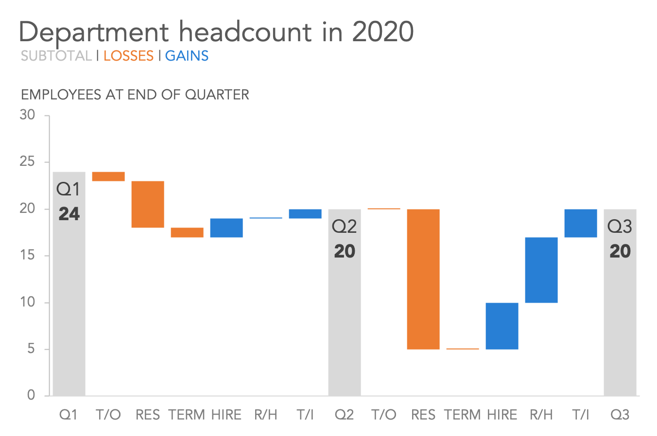
Are you looking to visualize how values in your dataset increase or decrease over time or across different categories? A waterfall chart in Excel is the perfect tool for this. Waterfall charts are especially useful in business settings to show the sequential breakdown of changes in financial data, project management, or any scenario where you need to present the cumulative effect of positive and negative values. Here's a detailed guide on how you can create a stunning waterfall chart in just five easy steps:
Step 1: Prepare Your Data
Before you start creating the chart, ensure your data is set up correctly:
- Create Columns: You’ll need a column for the categories or stages, and columns for the corresponding values. A starting value, intermediate changes (both positive and negative), and an ending value are essential.
- Include a Base Value: Add the initial value at the top or bottom, depending on your data structure. This will be the base from which changes will start.
Step 2: Insert the Chart

Follow these steps to insert your waterfall chart:
- Select your data range including headers.
- Go to the Insert tab.
- Click on the Waterfall Chart icon in the Charts section.
- Choose the basic Waterfall Chart style.
Step 3: Customize the Chart
Now that your chart is on the screen, you can adjust its appearance for clarity and visual appeal:
- Change Data Series: Click on any column in the chart to customize or format the series. Set the starting value and ending values to show as totals or subtotals.
- Adjust Colors: Use the Chart Tools > Format tab to change the colors of the bars to represent increases (usually green), decreases (usually red), and totals (usually gray or black).
🔹 Note: For a professional touch, ensure that your chart colors reflect your brand or the common color standards for financial reporting.

| Change Type | Color | Description |
|---|---|---|
| Positive | Green | Represents increases or gains |
| Negative | Red | Represents decreases or losses |
| Total/Subtotal | Gray/Black | Used for the starting and ending points of the chart |
Step 4: Add Data Labels and Annotations
To make your chart more informative:
- Add Data Labels: Right-click on a column and select Add Data Labels to show the values directly on the chart.
- Customize Labels: Use Format Data Labels to specify whether you want to show just the values, percentages, or labels.
- Add Annotations: For key changes, add text boxes or callouts to highlight significant points or explain sudden jumps or drops in data.
Step 5: Review and Share
Now that your waterfall chart is nearly complete:
- Check Accuracy: Ensure all values are accurately reflected in the chart. Double-check that the sum of changes matches the ending value.
- Finalize Formatting: Adjust the chart’s title, axis labels, and legends if needed for clarity.
- Export or Share: Use the File > Export options to share your chart via various methods like PowerPoint presentations or save as an image for reports.
In summary, a waterfall chart in Excel helps you to present changes in financial data or any value over time in an understandable way. By following these five steps, you can quickly create, customize, and share an insightful chart that can aid in presentations, reports, or personal data analysis. The visual representation of how values progress or regress over different stages allows for immediate comprehension, making it an invaluable tool for business analytics.
What is the main purpose of using a waterfall chart?
+A waterfall chart is mainly used to visually depict the sequential breakdown of how a total value is affected by various contributing elements, showing how positive and negative values accumulate over time.
Can I use a waterfall chart for non-financial data?
+Absolutely! While commonly used in finance, waterfall charts can illustrate the change in any quantifiable data, from project progress to performance metrics over time.
How do I handle multiple negative and positive values?
+The chart will automatically stack them. Ensure you color-code them for clarity, with green for increases and red for decreases.
Do I need to calculate subtotals or totals for a waterfall chart?
+No, Excel automatically calculates totals based on the data you provide. However, you can manually format columns to represent totals if needed.
Can I change the order of bars in my chart?
+Yes, you can easily reorder bars by changing the order of your data in the spreadsheet. Excel will adjust the chart accordingly.
Related Terms:
- Waterfall chart Excel
- Waterfall chart Excel template download
- Cara membuat Waterfall Chart
- excel waterfal chart
- waterfall chart template excel
- ms excel waterfall chart


